Tuesday, August 26, 2014

26/08/2014

What do the fashion house Hugo Boss and the Lernaean Hydra of Greek mythology have in common?

Well, I’m glad you asked. Not a huge amount, as it happens. One is a scaly oversized monstrosity, and the other is the Hydra. Ha! The one-two punch. Classic.

No, I’m not lazily cynical about large international fashion houses – though I’ve always found “Boss” as a brand name a little wankerish. Call me judgmental, but I can never help but attribute a few notes of swaggering overconfidence to anyone who swathes themselves in garments with the word “boss” stamped all over them. Or indeed, to those who do the stamping. I’m considering retiring this mentality for two reasons: the first is that the only lounge suit I own is from Hugo Boss (bought years ago, before I knew any better), and I’m desperate not to be hoist with my own petard (though if I keep using expressions like that, the Hugo Boss suit won’t be my biggest problem).

The second is that Hugo Boss is not the cocky fictional name I once thought it was, but actually just the name of the guy who set up the company. What’s more, he was German, so in his own language and in the original language of the company, the name was entirely unburdened by linguistic associations which for better or worse now wrap themselves around its Anglosphere operations. You can’t fault Hr. Boss for growing up in a world where the flourishing lingua franca condemned his surname to connotations of self-importance*.

Hugo Boss was born in Metzingen in 1885.
Back to the original question. The similarity is this: when you cut the head of the Lernaean Hydra, two more heads appear in its place. The same is true of Hugo Boss. Once the slicing starts, the unified Hugo Boss label disappears – and in its place appear ‘Hugo’ and ‘Boss’.

The latter is “traditional”, “classic”, “timeless”, where the former is “younger”, “more fashionable”, “cheaper”. To roughly quote my colleague in women's fashion. But Hugo Boss isn’t the only company to cut its own name up into horcrux-like component parts. Paul Smith have a range under the name PS; Michael Kors has Michael; and in recent years, Ralph Lauren have introduced the lines Lauren Ralph Lauren and Ralph Ralph Lauren (now known as RRL), in a speculative exercise designed to baffle and frustrate their customers. Marc Jacobs are the only ones trying to make light of all the absurdity - their website banner shifts between "Marc Jacobs (not to be confused with Marc by Marc Jacobs)", and "Marc by Marc Jacobs (not to be confused with Marc Jacobs)". Or maybe they're just genuinely concerned.

That opportunities for price discrimination and exposure to new demographic groups motivate the formation of these offshoot imprints, often cheaper than the originals, is fairly clear. What I find striking is that these companies are so keen to recycle their own names when these offshoots are created. Why do they limit their linguistic inventory to existing company titles?

Probably because the names are recognisable, and provide continuity with the original brand. But then, so does Weekend MaxMara, and Armani Jeans, and Bogner Fire + Ice. The difference is that these latter examples add new words to at least hint at what their angle is, rather than lazily grabbing a name from the pre-existing company title and repurposing it.

This is where my patience for Hugo Boss runs out. It’s not their fault that the surname of their founder corresponds letter for letter with the English word “boss”. But it is their fault that they take this surname, isolate it, and blazon it in big letters above the full title. And it’s that branding which tempts me (against my better judgement) into thinking that Boss designers and wearers alike are self-important arses. Dammit, I need a new suit.

It’s hard to keep your balance when you have such a big head.

*Though you can fault him for being a Nazi.

Thursday, August 7, 2014

03/08/2014

It has occured to me that I’ve thus far dealt only with the most glamorous aspects of form processing. But beneath the glitzy themes of statistics and handwriting, there’s a whole underworld of other, equally meritorious material that passes through my hands on a daily basis. What of the unsung heroes, the men and women, the addresses and phone numbers that find themselves trampled underfoot, like serfs beneath a giant elephant? This article is dedicated to them.

A town called Groitzsch.

Only the Germans would take it to five consonants with impunity – and boy have they picked a lively bunch here. If you try to pronounce the letters “tzsch” in isolation, it produces a kind of laser sound. Yet there is something distinctly un-laser-like about the name Groitzsch. Which begs the question: what is this mysterious town, with its surfeit of consonants and its curiously counter-onomatopoeic name? What’s it all about? The answer is that I don’t know, because I just read it on a form once and didn’t enquire any further.

A street called Am klein Flottbeker Bahnhof

In the four words this street sees fit to accord itself as a title, not one of them actually means ‘street’. To translate roughly, I make it out as “beside the little train station in Flottbek”. The advantage of this street name is that if anyone ever asks you where it is, you have a ready-made answer at your fingertips. Ingenious. Why don’t we name all our streets this way? You could drive down “Near the nature strip next to the canal” street, before taking a left turn into “Between near the nature strip next to the canal street and behind the church with the green door street” street. But without the “street”s, obviously. Exciting times lie ahead for Hamburg’s city council, if only they take the plunge and extrapolate.

A woman called Frau Muckenschnabel

I haven’t really checked this. But I’m pretty sure mucken means “to chatter”, and Schnabel means “beak”. So… Miss Chatterbox? This, along with my current employment in the company of a woman named Fröhlich (“happy”) is drawing me slowly into the suspicion that Germans are named one and all after Mr. Men characters. In any case, there’s a fascinating and socially revealing history behind the formation of the name Muckenschnabel. I assume. Consult the Internet to find out more.

A man called Herr Mannsbart

It doesn’t get more masculine than this. This even outdoes “Mr. Men” for brute masculinity. It’s “Mr. Man’s Beard”. What did this man’s ancestor do to get a name like that? Did he stroll into the village one morning, with his proud mane bristling in the sunlight to the utter admiration of his fellow village people? Did they point at him from a distance and say: “Look! That man. His beard. That man has the beard of a man. Henceforth, he and his progeny will be known as Mansbeard.” Maybe. Again, I can’t really comment. Though I would ask you spare a thought for his female progeny – as striking as Mr. Mansbeard is as a name, it has nothing on Mrs. Mansbeard.

--------


Well, if that doesn’t provide the third dimension to my experience in customer services, I don’t know what will. And I’m afraid I’m yet to select a favourite telephone number – though I enjoyed reading that one of our clients was born on 18/14/1973. Glad I’m not the only one trying to keep things light.

"I would like a store loyalty card, please!"

Wednesday, August 6, 2014

30/07/2014

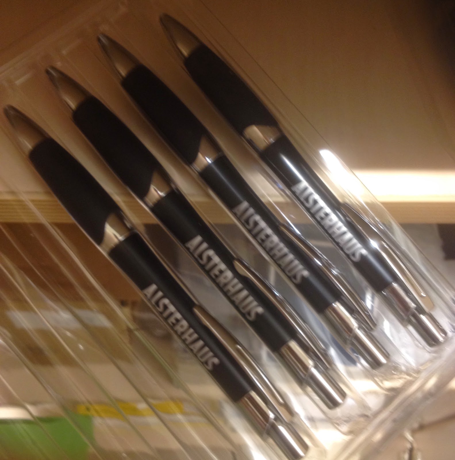
Bingo! Thank you, Herr Neumann. You are warmly invited to collect your congratulatory luxury food hamper from the Alsterhaus Feinschmeckender Boulevard! Actually, you’re not. We don’t sell food hampers, and if we did, I wouldn’t have the authority to offer you one. But here’s a pen with “Alsterhaus” written on it! Thanks again.

Yours sincerely,

Walter Myer
Junior Customer Services Assistant

No one will notice if one goes missing...

This is the letter (and some of the pens) I considered posting today, after an eventual, glorious triumph in my personal game of bingo. Here’s how the game works: every day, I enter the contents of about a hundred handwritten applications for Alsterhaus loyalty cards into the store’s electronic database. One of the fields I am required to enter is the customer’s date of birth, and as I do this, the history of previously entered birthdates with matching digits appears in a pre-emptive pop-up box beneath the field. So having typed “05”, the box might suggest “05.09.1973” and “05.05.1956”, if those dates have already appeared in previous forms. The aim of my game is to use this pop-up to determine whether a certain day (eg. the 5th, the 12th, etc) has appeared in combination with every month of the year. When I find a day that has, I have reached bingo.

I always knew it was a bit weird, but written down it looks pathological. Which makes me think, if it’s hard to explain here, how on earth will I fare in German when Herr Neumann comes to pick up his Alsterhaus branded notepad?

Well, I suspect I’ll have a shot, because the Germans seem to like their numbers. This I’ve learnt recently, with the story of five lottery balls selected in sequential order hitting national headlines. The statistical anomaly was then discussed avidly around the water cooler at work the next day*. Finally, like-minded people! Is what I would've cried if I didn’t find it all a bit boring. So I apply double standards in my passion for different statistical events, shoot me.

That's not Numberwang.
In any case, Herr Neumann may never understand exactly why he made my day. But it’s thanks to his inspired combination of being born on the 20th March and wanting a loyalty card that my game has finally come to an end.

Only, it hasn’t. In bingo, the game ends when someone wins. The participants jealously applaud, the toupéed presenter packs up his equipment and half-baked rhymes, and everyone takes the bus home. Not so in the world of forms. Here, the game runs on long after the initial suspense has been punctured, pressing daftly into the eternal. Or more likely, until the installation of a direct customer interface registry system.

Which is kind of an important point. As much fun as I’ve been able to generate from converting handwriting to Helvetica, I have performed the role of the quintessential superfluous middleman, and even I know that I need to be cut out. It is senseless for customers to provide their details in writing, sitting three feet away from the computer at which an employee will process the information after two weeks of backlog. Give the customer the computer! Help them with it if they’re unfamiliar with the technology, and the paper forms can always be kept as a last resort. But otherwise, it’d be foolish to pass up an option which saves customer time, employee time, and paper. Heed my call, Alsterhaus, and protect the forests. I will now translate this into German and nail it to the entrance of the local church.

*Sadly, this is a proverbial water cooler – customer service annoyingly doesn’t have one. I fill my water bottle from the taps in the toilets.

Monday, August 4, 2014

28/07/2014

Here’s a test. What does the following word say?


It’s not a dash. I know what you’re thinking, and the fourth character is not a dash. It’s a legit letter. Can you figure out which one?

Of course you can’t, it’s a horizontal bloody line. There’s nothing in the Roman alphabet shaped anything like this – and let’s not forget the fact that it’s about triple the width of every other character. If this image were used as a CAPTCHA, anyone in their right mind would fail.

So think of my last two weeks as an extended, advanced-level CAPTCHA examination. As mentioned in the previous article, I have spent large tracts of my time in Customer Service collecting personal information from loyalty card applications and entering it into the store’s database. Poor handwriting has helped punctuate the monotony of the task, but sometimes only by virtue of providing a new, more infuriating exercise, and to this extent it is both a blessing and a curse.

In reading through piles of filled out forms, I am occasionally led to think of the German word for bad handwriting, which is Klaue. This is a good example of the evocative metaphors and language-internal borrowings so common to German* – in its literal sense, Klaue means “claw”. For me, it conjures up the image of a figure hunched over a desk, clumsily clutching a writing instrument between overgrown fingernails and using it to produce a jagged, unintelligible scrawl.

I have seen much of the German Klaue in the past days. When exposed to poor handwriting in large quantities, you begin to learn that the expression of “deciphering”** it is more than just a throwaway dramatisation. With email and postal addresses at stake, and the misinterpretation of a single character risking invalidating hard-won customer information, I’ve needed to develop procedures and techniques to make sense of the senseless. These have included grouping sections of wild pen strokes and mapping them to commonly occurring letter clusters, or trying to correlate the more legible letters in the script with the scratchier parts. When you eventually solve the puzzle, it’s the feeling of recovering a corrupted file, and there is an appreciable sense of satisfaction to it.

There is frustration too. Frustration that some people can’t write their own names and addresses clearly (combined with my suspicion that these same people take some perverse pride in the idiosyncrasy of their incomprehensible style). To some extent, poor handwriting can perhaps be forgiven when the content of the message is interesting, urgent or profound. But it’s a complacent individual who thinks that their home address and phone number fall into one of those categories.

I have enjoyed it, though. Thanks to the highly international Alsterhaus clientele, I now possess gratifyingly inconsequential skills in the identification of nationality through handwriting, whether it be the block-like Chinese rendition of the Roman alphabet, or the neat, tightly italicised cursive of a female Muscovian hand. Only trends, to be sure, and there are no perfectly consistent patterns, but then consistency would spoil the fun. And all the while, plenty of Klaue to keep things vexatious.

It was an ‘m’, by the way – the word spelled ‘Marmstorfer’. I mean, it didn’t, but you know. Customer’s always right. I leave you now with the unhinged handwriting of a man called Ulrich – this is his take on the number ‘15’.


*Though it’s a rubbish example of the better-known German practice of word compounding. For this, note Sauklaue, which adds the word Sau (“sow, pig”) to the original Klaue to produce roughly the same meaning, but with that swine-obsessed Germanic edge.


**The Germans use a similar word for “deciphering handwriting”, namely enträtseln. It literally means “to un-puzzle”. Or, I guess, "to de-cipher". Insightful, Walter.